Typography I

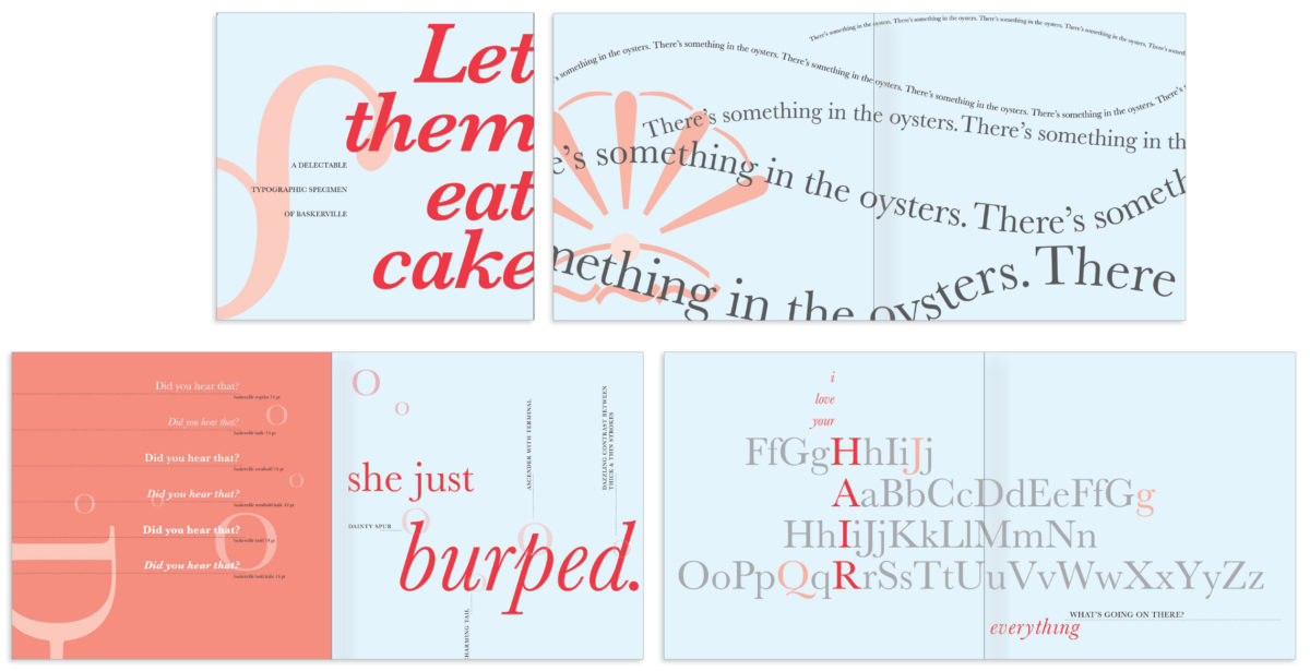
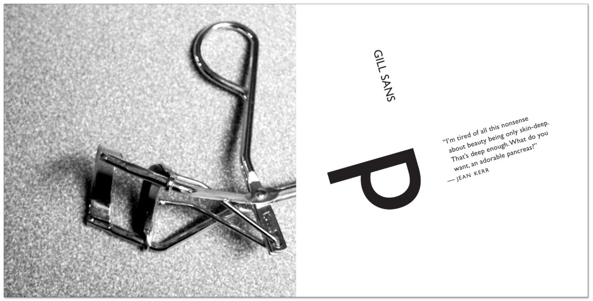
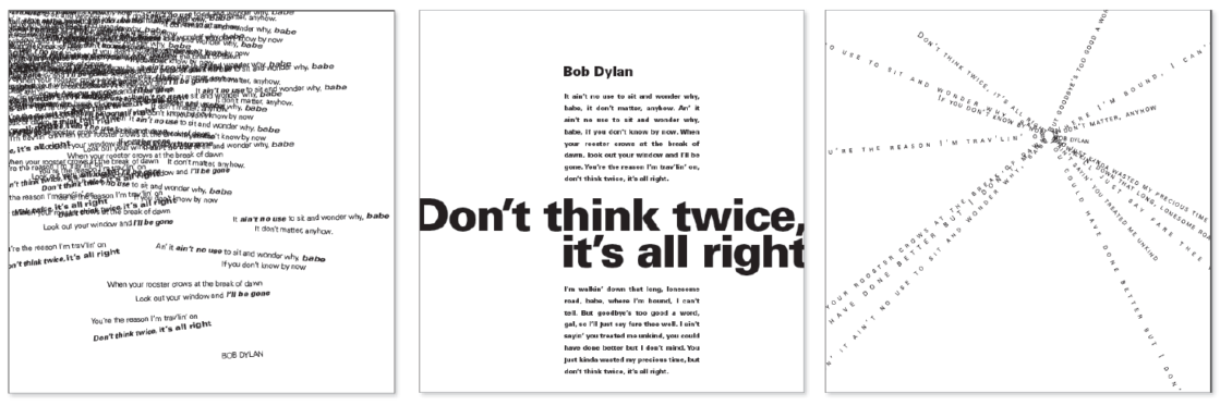
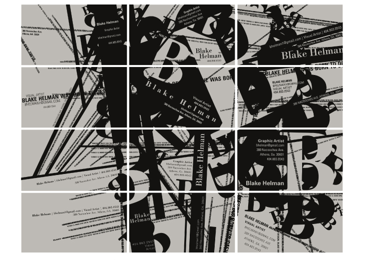
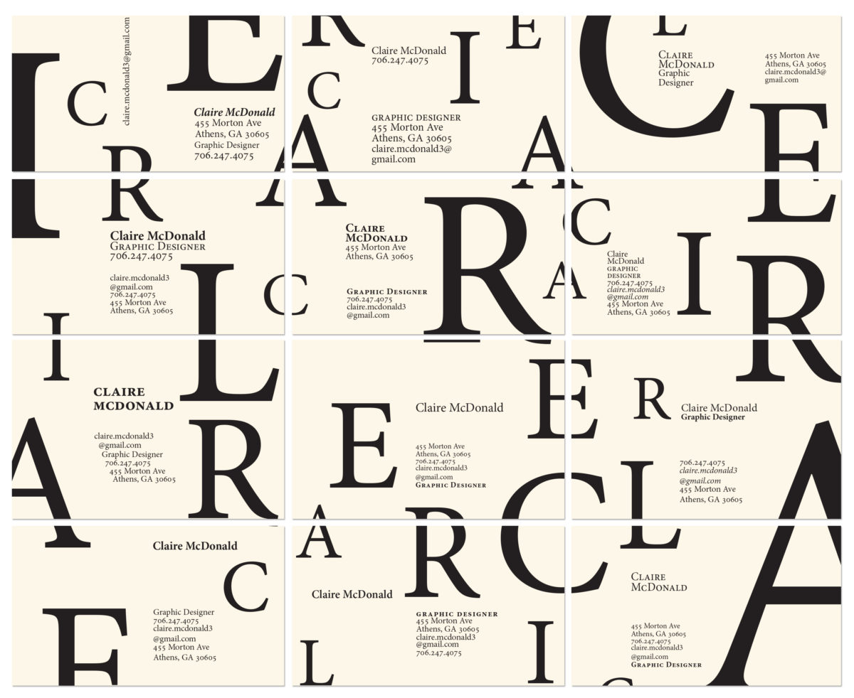
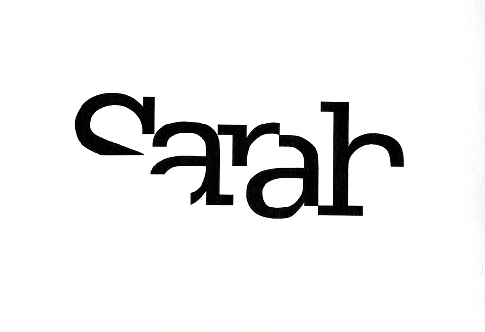
Typography I is a course for first-semester majors that introduces typography as integral elements of visual communication design. Students gain an understanding of the importance of skillful typography in effective graphic design and develop a sensitivity to the needs of viewers/readers through an awareness of the extreme subtleties inherent in typography.

Project topics cover letterform anatomy and terminology, principles of spacing in typography, the visual enhancement of language and message, principles of legibility and readability, and information hierarchy.

Typographic Specimens

Students explore the breadth and flexibility of an entire type family. Examples below reflect both digital and print/booklet formats of the project.

Typographic form + image: letterform spreads

Typographic Hierarchy and Alignment

Students explore the relationship between form and content, and how we visualize spoken language. Based on various typographic perimeters, students design multiple compositions with provided text while saying attuned to underlying messages and how we interpret meaning through typography. Students examine the formal attributes of type (form, weight, scale, color, etc.) while also exploring typographic semantics (meaning) and syntax (arrangement).

Micro/Micro: Type as both Image & Info

Students explore typography as both information and graphic element, by designing 12 personal business cards using only typographic elements. Each individual card must have an original design yet all 12 must work together as a composition.

Letterform & Legibility Studies

Students explore the legibility of each letterforms in their name, ultimately designing a namemark/personal logo which they ink by hand.