
Design of the Mundane:
Bad “design” wastes time.
Last summer, I found myself at the DMV trying to get a state ID for my kid, who needed it for travel. Naturally, I was prepared: I had completed the online application portion ahead of time, and printed and organized all the required paperwork.
We waited in line, of course….until we reached the bouncer, whose job was to pre-screen customers before assigning them to service windows. But instead of waving us through, we got kicked out of line. The issue? The required middle school transcript (required as proof of residency) supposedly didn’t include our address.
This “transcript” was nothing more than a poorly conceived, editable Microsoft Word document—the kind where you could effortlessly change all your grades to a perfect 99 if you felt like it. And yet, this unimpressive sheet of paper was an official part of the process.
At first, I was discombobulated: I knew the address was there because I’d checked everything. After taking a closer look, I realized the problem: the design was so bad that the crucial information was practically camouflaged. The address was in the document, right in the top right corner—but the lack of visual hierarchy made it nearly invisible to the DMV gatekeeper.
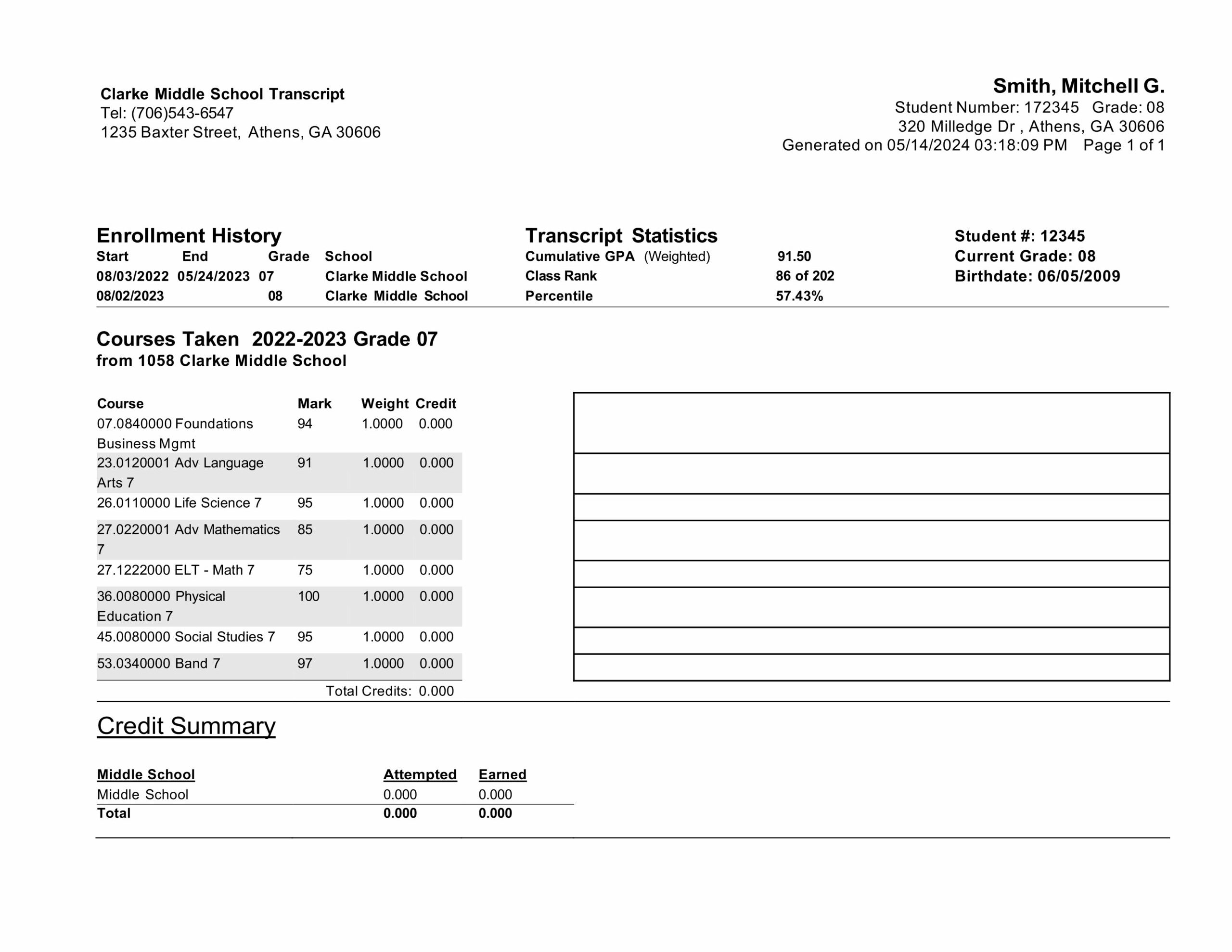
^^ The culprit. (What is the purpose of the big, blank table on the right?)
Was this “bad design”? No—it wasn’t designed at all.
This transcript wasn’t thoughtfully laid out; it was just a document someone threw together. Unfortunately, we encounter these kinds of poorly considered, unintentional artifacts of communication every day—flyers in doctor’s offices, bulletin board announcements, healthcare invoices, and forms of all sorts. These items aren’t seen as needing design, yet their inefficiency costs us time, frustration, and sometimes even real consequences (like in bad voter ballot design, especially the infamous case of Florida’s butterfly ballot in the 2000 election. See the full case study here.)
Most everyday documents—vernacular flyers, forms, and ads—are not designed by actual designers. Instead, they’re assembled by someone with access to desktop publishing software (or even just word processing software), leading to: cluttered layouts with little or no hierarchy, clichéd visuals, and lack of clear messaging (aka, “Emphasizing everything means emphasizing nothing.”)
Back at the DMV, after losing a chunk of time, we got back in line and eventually convinced the screener that the address was, in fact, present.
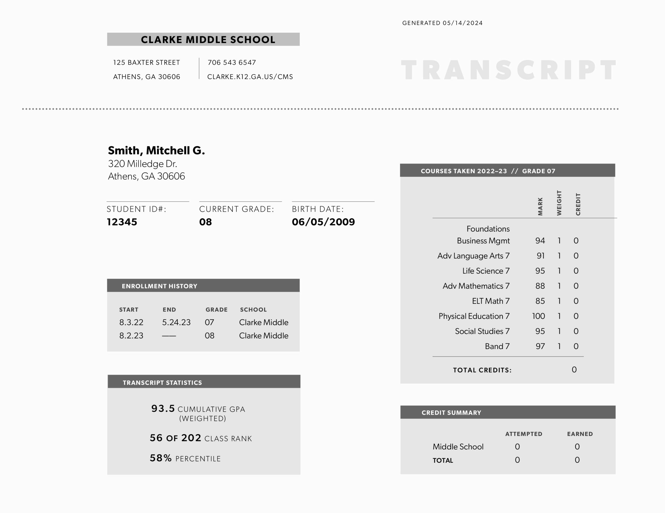
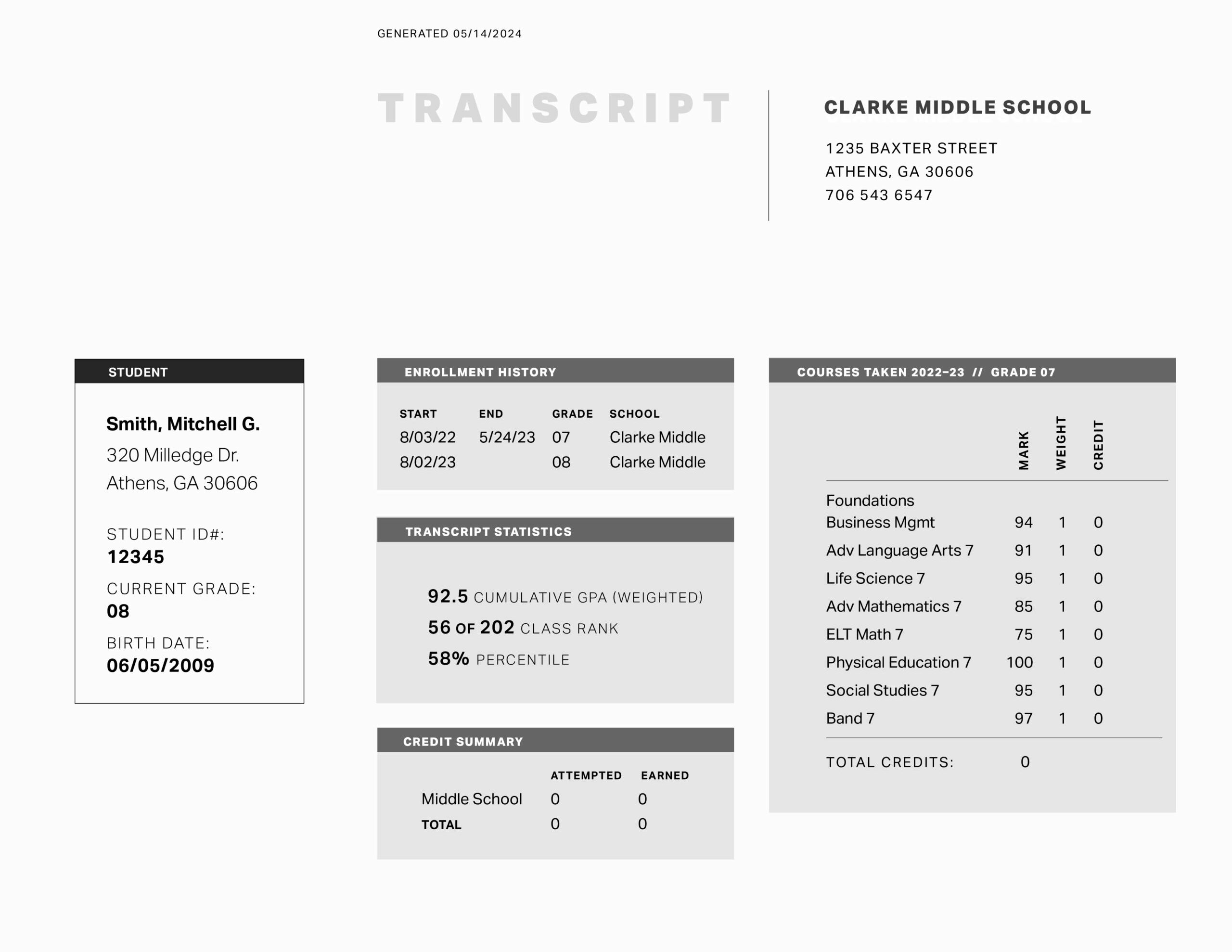
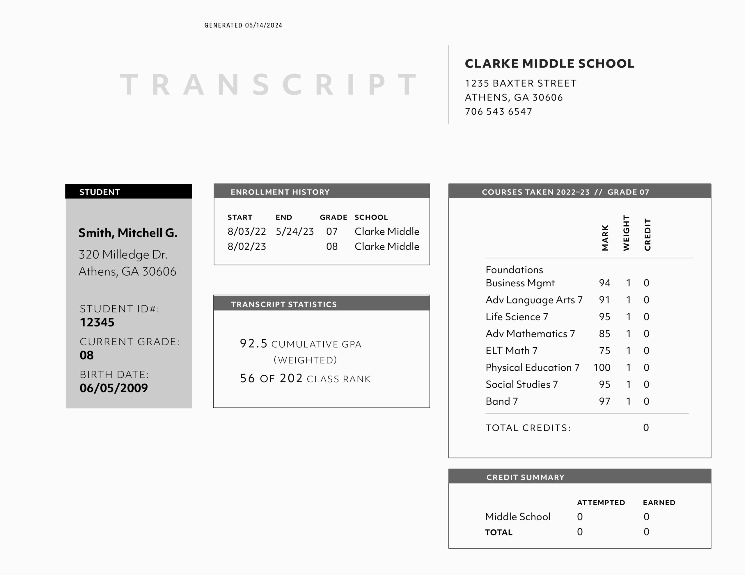
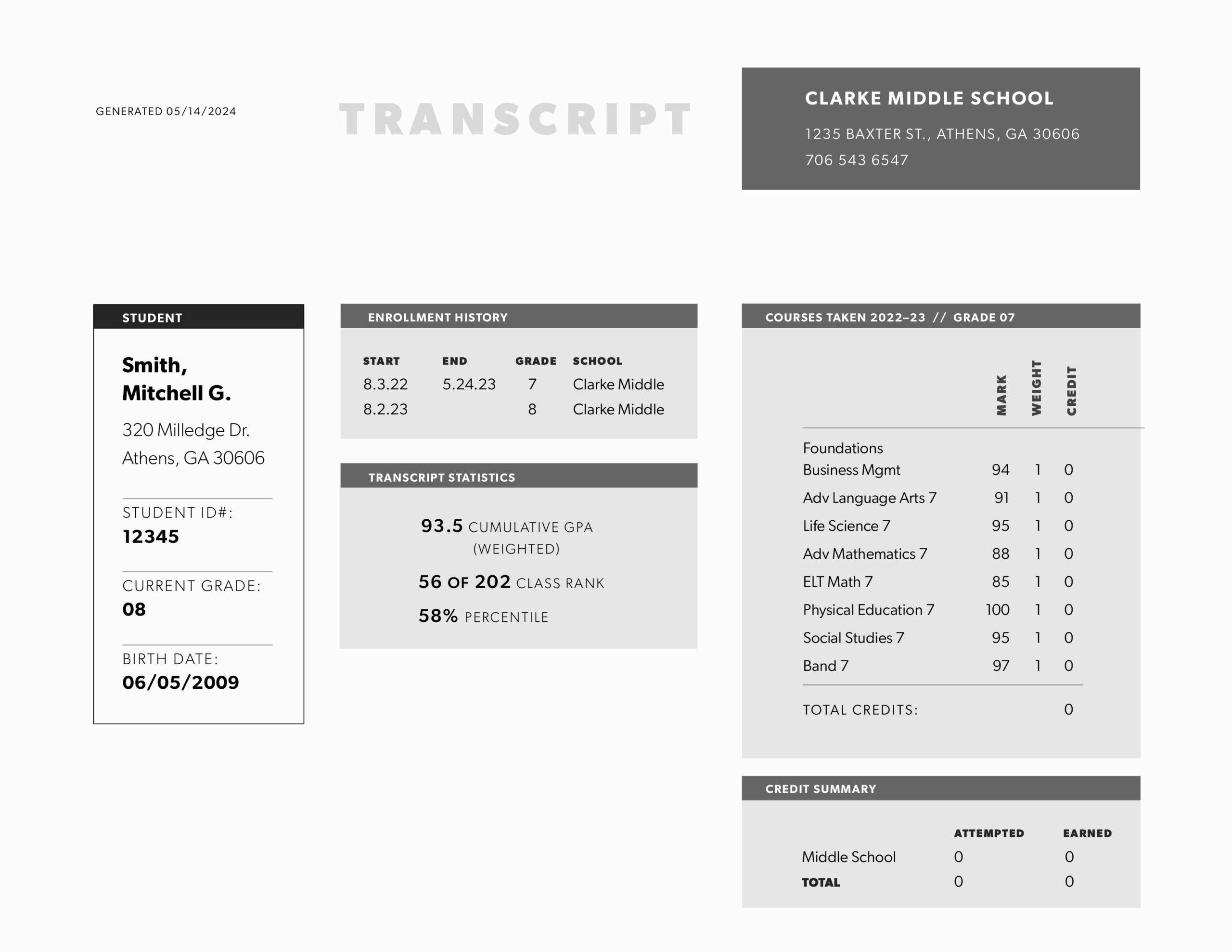
Turning Frustration Into a Typography Lesson
Of course, I couldn’t let this go. I took the transcript and did some quick redesigns, applying basic principles of hierarchy and composition, and using thoughtful white space to make the information more readable and clear.
This experience inspired a class exercise in Advanced Typography last fall. I brought in real-world artifacts—an insurance Explanation of Benefits (EOB), an invoice, etc. —and asked my students to first critically analyze the information and structure and then redesign them.
Some key considerations:
- Is the right (or complete) information even present? (Why is the URL missing?)
- How does the hierarchy affect readability?
- Are the items that should have the most emphasis most emphasized?
- Could simple changes like typographic hierarchy or color improve legibility?
Ultimately, this DMV ordeal became a lesson in the unnoticed impact of design (or lack thereof). Even the most mundane documents affect how we move through the world—so why can’t they be better?